Progressive Disclosure
Progressive disclosure is one of the most useful tools in CxUX, the idea is that you should initially only show the user a few options, allowing them to see a larger set upon request, thus reducing interface complexity. The initial options should be the minimal core/ essential set (if there are any), or a logical sub-set of all available options if that split is not easy to make. The worst thing you can do with progressive disclosure though, and this is important so pay attention now, is to remove the user from their current context; controls or workflows that require a context change (like a new window, or full screen modal) should be designed out and changes should be made inline (or as inline as possible via PopOvers for example) where possible.
Obviously, the advantages complex artifacts and systems can bring are often so great that they overshadow the inconveniences and accidents their complexity may give rise to in our interactions with them. Complex interaction has thus typically been presented as a problem, an undesirable side effect of a superior technical solution, to be solved by interaction designers. Consequently, designers have been hard at work trying to make complexity disappear from the user’s view, sometimes perhaps too hard.
Janlert, L. E. and Stolterman, E.
TLDR
Good ways of adding progressive disclosure:
- Tabs.
- PopOvers and Pseudo-Modals (with a strong context).
- Presentation sheets.
- Sidebars (including slide-overs and pop-outs as long as they're obvious).
- Menus, sub-menus, and, three dots menus.
- Inline Controls / Direct Manipulation. This excludes 'modal tools' (see below).*
Neutral ways of adding progressive disclosure, use with caution as they can go wrong:
- Modals - for critical/ destructive actions.
- Rollover Areas - e.g controls get hidden when the mouse is outside of a given area.
- Contextual Menus - discoverability is a factor for beginners with these, though for intermediate advanced users they help rather than hinder.
- Rolldowns - these constantly fail user testing in our experience, but I personally don't mind them.
- Workflow Wizzards - these remove the user from their current context, which is very bad, however for some uses like setting up complex projects (in an IDE for example) and such they can be amazing. Setup/ Onboarding wizzards are also great of course. Modal Tools - specific modes for editing certain aspects of given data. Beware of mode slips!
Bad ways of adding progressive disclosure:
- QuickTime's content blocking playback controls in the content area.
- Widget Replacement - Music on macOS used to be guilty of this but it's now thankfully fixed. Airtable however...
In Depth
Tabs
Tabs are an excellent way to progressively disclose controls as they have a helpful built in title, I love self documenting controls.
- Remember to make it clear which tab is active.
- You can place additional information (e.g icons/ feedback) in the tab item if you need to, see the below example.
- Consider adding the ability to re-arrange and close tabs, and the ability to close everything except the open tab (Apple's Safari is the gold standard for tab behaviour if you need inspiration).
- Consider drag and drop actions that go between tabs, or that require tab switching, again, see the example below.
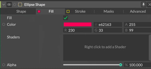
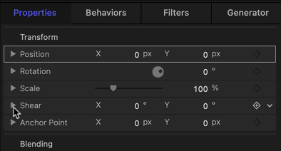
Tabs in Cavalry contain additional information in the tab item (fill and stroke colour). You can also drag between tabs, and note that the active tab is very clearly obvious. The controls are split into catagory tabs, with rarely used advanced controls relegated to the far right tab.
Popovers and Psudo-Modals
Popovers
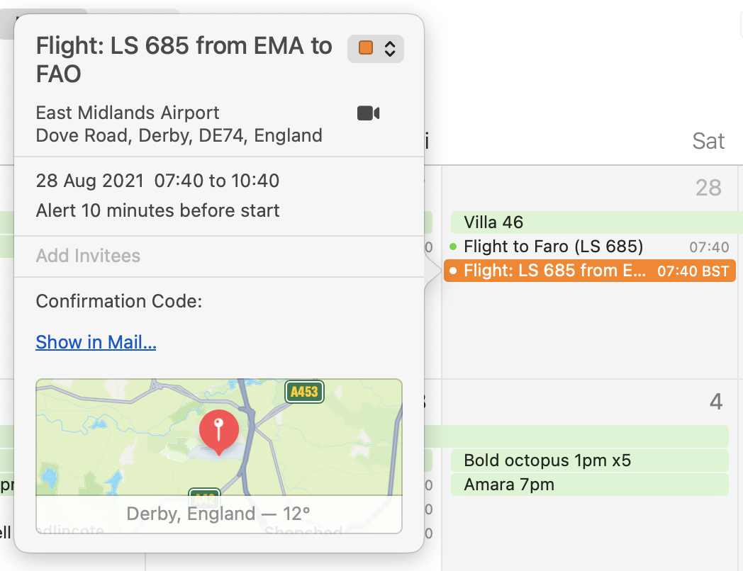
Invented by the Apple iCal team in 2009, PopOvers were quickly adopted as a near perfect way to reveal complexity. PopOvers are quasi-modal, that is to say they appear like they're modal, but they aren't, giving them all the advantages of modality (like focus), without any of the drawbacks (like a requirement to interact with them). To dismiss a PopOver you click outside it, you can also drag them around to move them out the way of any important contextual information (Cavalry does this in a slightly different way, see below). PopOvers appear in different locations depending on what screen space is available, so they may appear above/below or to the left/right of their calling point.
Finally, PopOvers have a neat little arrow that tells you where they came from adding extra contextual information. They're such a great idea, 10 points to whomever came up with them.
Pseudo-Modals
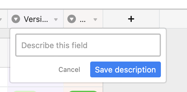
Pseudo-Modals are like the PopOver's sickly twin. They're generally pretty good, but without some sort of selection indication, the lack of context can be confusing. In this (edge case) example, I've asked Airtable to edit the description of a field - but which field is this the description for? With a true PopOver, an arrow head would indicate the field in question (along with all other other benefits like mobility).
Modals
Modals have so few good use cases that I'm just going to list them, because they are an absolute last resort UX pattern due to their blocking nature and flow/context disruption because of the fact they must be dealt with, here's where they're okay:
- Destructive actions that require confirmation. For example, overwriting some data the user might care about.
- Critical workflow junctions where the user must make a choice that cannot be otherwise inferred or chosen ahead of time, like Open, Save, Import and so forth.
- Blocking wizzards, such as one for setting up a new project in a content creator or IDE, or a wizard for setting up an OS on a shiny new computer.
- As a feedback mechanism for blocking actions (like a progress bar modal when doing a huge data import) that cannot be done asynchronously (progress bars for asynchronous actions should be psudo-modal or non-blocking elsewhere in the UI).
That's it, we're done.
A word of advice, if you find yourself with a modal in your workflow, consider designing it out. In Figma for example, modals are thrown up in the middle of the screen (e.g by the requirement to name a new Grid Style) when simplifying the workflow would mean they could be avoided completely (just create the style, and let me edit the name inline - bonus points for putting me into the renaming state automatically). Naming a Grid Style is not a destructive or critical action, thus a modal is not warranted and simply causes needless friction.
Sidebars and Presentation Sheets
Sidebars
On desktop and mobile it's very common to see sidebars - these can be hidden and shown at will and contain related functionality to the window that houses them. When used well they don't remove or cover too much useful contextual information, and they are always non-modal. The activation button should also be obvious, the above example could of course do with it's button labelling.
Presentation Sheets
As for modal presentation sheets (the thinking person's modal dialogue), these have pretty much disappeared on the desktop, Apple used to use them for their Print/ Page Setup and toolbar customisation dialogues, and they were all the better for it. A big advantage of presentation sheets is that they are attached to the window that calls them, giving them a strong context in multi-window applications. Thankfully they are still going strong on mobile.
Menus
There isn't a huge amount to be said about menus given that we've all probably had tens of thousands of interactions with them, thus demonstrating their importance, and simplicity. I'll try to share a few tips non the less.
Contextual menus are a great way to 'bury' complexity, but be warned, they're not very discoverable, and if a user doesn't know that a feature or option is there, they can't use it, so as a rule of thumb, we try to make sure that contextual menus are never the only way to do something, instead we place accelerator workflows and frequently used utilities in them. One more thing to note about menus is this great gem from NNg on Designing Long Menu Lists.
On ordering menus, (when you're not listing things in alphabetical order), there are a few things you can do to keep things clear:
- The first things you do go at the top (e.g New and Open).
- Order everything else by frequency of use.
- Put keyboard shortcuts in menus for learnability.
- Group similar actions with separators, there are usually any number of ways to group menu items, just pick a route and stick to it.
- If you have lots of menu items, let your menu be tall! Don't artificially crop the menu box to a fixed height, this slows down users, the brain is very good at scanning long lists, making people scroll is slow!
Search in menus is exceptionally useful, on macOS apps get this for free, but on the web, mobile and Windows, you'll need a custom solution for this exceptionally useful functionality.
Here's an example of stretching the menu pattern (hopefully in a good way), on the right we have a drop-down menu (sometimes called a combobox), in Cavalry this sometimes gets used as a way to edit the controls available on a layer.
The reason I'm showing this is because there are a few neat things on offer here:
- The drop-down menu is searchable
- Focus is put into the search field when you open the menu (so you can just start typing).
- The top search result is automatically selected.
- Hitting return will switch modes to the selected row.
- Pressing escape will close the menu.
- Using arrow keys will navigate the menu.
- Beginners can just use the mouse 😁
As a final word on dropdown menus, I often hear UI designers say you should never have a dropdown with only two options and that in that situation a checkbox should be used, this is unmitigated nonsense. If it's helpful to users to have mode titles (i.e self documenting controls) then by all means have a dropdown with two entries; clarity is paramount in complex software design.
Radio buttons are all but extinct in modern UI design, they have been replaced in general by dropdown menus (for long names) and segmented controls (for short names). There is one exception, when a user needs to see all options up front, and you need to reinforce the choice by comparing the chosen option to all the others, radio buttons (or a visual remix of the idea) is very appropriate. Think choosing payment options, selecting a plan tier, choosing a gender, a shipping option etc.
Inline Controls/ Direct Manipulation
Inline controls are not just useful, they're often fundamental to the frictionless operation of software, as not everything can or should be done in property panels and menus. However, as with all things, there's a good way to do it, and a bad way. As a rule of thumb:
- If a control manipulates something inside the content area, there is no problem.
- If a control manipulates the content area itself, having it inside the content area is usually a bad idea.
Done well, it creates a seamless and clear way to operate software, providing context (showing current state) and providing a route forward for the user. Take this simple example from the wonderfully designed Craft. It's worth noting that even though you could call this a pseudo-modal (generally not as good as a PopOver), it still has strong context due to the selection of the text.
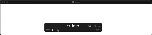
Let's take a look at where this can go wrong. Here we have a movie in Quicktime, and I'd like to scrub it, backward and forward to examine the video. Notice anything irritating? It's not possible to interact with the controls without blocking content you need to not be blocked. While this UI is very tidy, I'd personally file it under elegant failures. It could easily be fixed by, for example allowing the control panel to be moved out of the window at the bottom (and pinning it to the bottom edge so it can't be fully detached). Putting centralised immovable controls under the window would also work if there was no requirement to also be fancy as well as functional (I am not convinced the ability to move the controls adds anything). For an example of how this should work, see the exceptional Screen app.
Area Rollovers
Having controls disappear when the mouse isn't near them is a completely logical thing to want to do, it keeps screens clean and visual designers happy. There is a downside though, hidden things are quite obviously not discoverable, a user scanning a screen for a feature will not see it if it's hidden, therefore, mission critical features should never behave like this. The last thing you want is a user minesweeping your app for the thing they need to click.
The other downside is that they are a higher friction interaction, take the following:
- Scan for a button.
- Move the mouse to the button and click.
Compared to:
- Scan for the rollover area.
- Move the mouse to the rollover area.
- Scan for the button.
- Move the mouse to the button and click.
So while an excellent way to make a UI minimal and probably more likeable, if it's important, don't hide it.
Figma use rollover controls, mostly quite successfully, however this example baffles somewhat (though it's a harmless error really). As you can see there is a jarring movement of information without any justification (that I can think of). Irksome is the word that springs to mind.
For a generally terrible twist on this type of progressive disclosure, see the next section on Widget Replacement.
Widget Replacement
The idea here is that because screen space is so short on a 32" 5k monitor (this is sarcasm people), a clever thing to do is to have a piece of information on screen only when the mouse isn't nearby, but when the mouse approaches, you hide that information and replace it with a mysterious control of some sort.

The problem with this, is that the user has just declared an interest in that information by moving the mouse to it, and then you've gone and removed it. It's staggeringly bad design and I'm yet to see a valid use of it. Apple used to be very guilty of this in iTunes and then Music (where this was finally fixed in a recent version). However, I just happen to have a shaming screen capture which you can see on the right. The idea here is that I want to see how long a TV show is, so I scan down the rows to identify the show, then move the mouse over to the right to make sure I'm reading the correct number - only the number has disappeared and has been replaced — as if to specifically anger me — with a hamburger menu. It's not like there's not enough room for both!
Airtable also appear to like this bizarre patten. Here the crime isn't as bad, but once again, it's just unnecessary.
Show both you cowards!
Rolldowns
Rolldowns are essentially unavoidable in some types of interface (like a hierarchy), but they also get used to progressively disclose additional controls.
With hierarchies rolldowns have never been, to my knowledge, controversial, however with controls they have been known to cause confusion, the most common source being that a user rolls up some controls, then does another task, switches back to the previous task forgetting they have rolled up the controls, which they now can't find. You may think this daft but I've been on the receiving end of more "Where have my controls gone?", or "I don't have that control." support requests than I'd like to admit. There are more elements at play here (for example a clearer visual design would help I'm sure) and lists of rolldowns compound the problems, but hyper-flat UIs have made this a very difficult method of progressive disclosure to use successfully.
As an aside, Motion also uses the same affordance for it's rolldowns as it does for it's disclosure arrow, this is generally not a great idea as it can confuse users when the same symbol is used to mean different things. It would be much safer to use the standard right angle bracket style chevron here: >
This disclosure control confused me when I first saw it (which was a bit embarrassing) - though I understood what it was after clicking it. I'm not sure embarrassing users (even idiots like me) is the desired UX here.
Wizards
Don’t use wizards (or modals or separate contexts) for adding or editing information, they pull users out of the main working context - this is known to be very bad. On the face of it, wizards sound like some kind of clever progressive disclosure - however research has found that maintaining context is far more important than trying to keep the UI simple. For example, if you need to be aware of the current state of anything, it forces you to remember this, rather than just seeing it, users then need to re-contextualise when they are done with the current task. In short, discount the tools we know work (like pseudo-modals) before going context destroying multi-step modal. This point is made (ad-nausium) in the Interaction Design for Complex Problem Solving book. Instead you should design a way of working that does not require such context destroying interruptions.
Object / Verb vs Verb / Object
When editing a document do you select the text and then hit the delete key, or do you hit the delete key then select the text?
This may sound redundant to anyone who has never used VIM, but some software is based on this kind of backwards workflow. I.e, you go into a delete mode by pressing the delete key, then you select the thing you want to delete, then terminate the mode to commit your action. This is how word processors used to work in the late 1960’s and early 70’s until the late great Larry Tesler got ahold of them. Why do I bring this up? Well, beware of wizards, they often work in a similar backwards fashion, you open a wizard (that is to say, you choose the verb) then you select the object the wizard is operate on, then once you've completed the Wizard's setup, you commit the action. Spreadsheets also often have these modal / back-to-front workflows. These can confuse users as the normal pattern of use is reversed, this is something that can cause stop and think moments, or simply general confusion when done badly. Wizards that will perform an action on something you define AFTER opening the wizard are modal, and modes are generally bad, though of course there are exceptions (tool modes for example bring clarity to workflows, at the expense of occasional mode slips). As ever, use your judgement.