Tips and Titbits
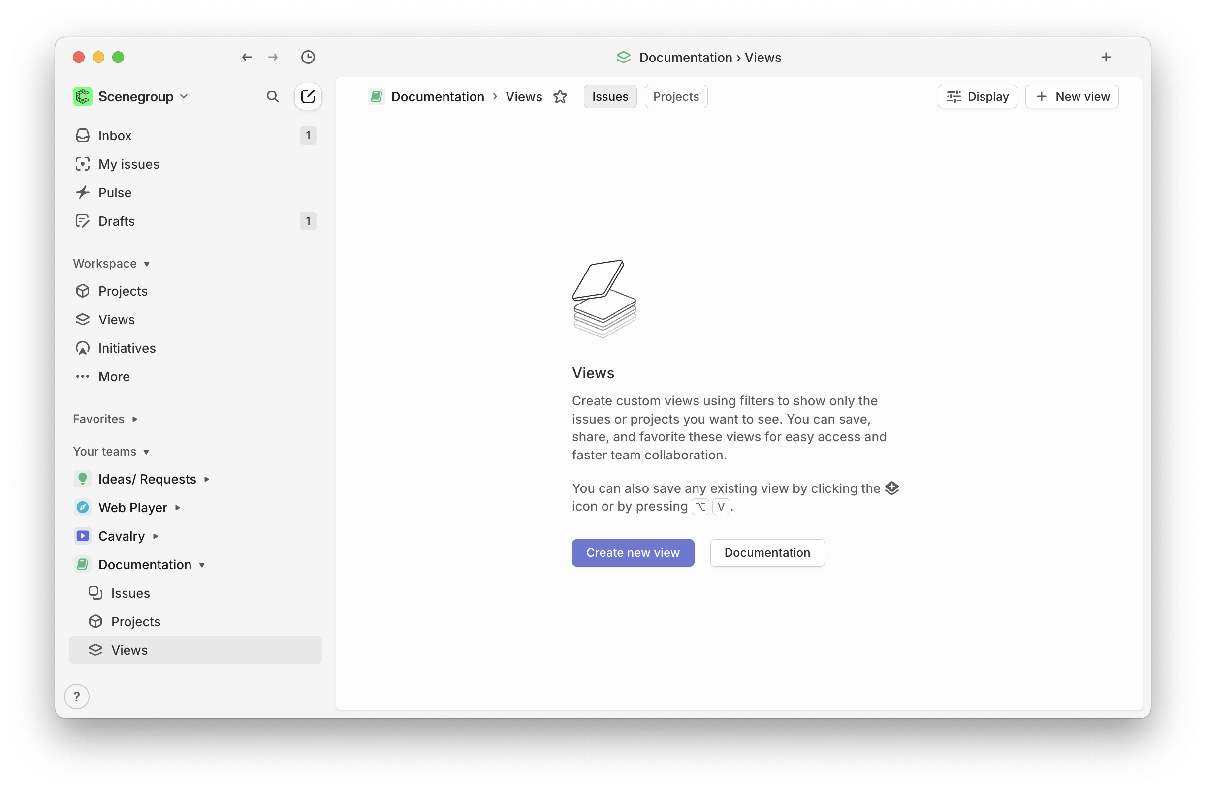
Use Empty Space
Empty space is the perfect place to add some help or a hint, or even a default dashboard.

Hiding vs Dimming Controls
Use Dimming
Tooltips on dimmed controls can improve learnability e.g “Available when X is enabled.”, one other point for developers is that UI libraries often offer a 'disabled' state for a control/widget, this can be read by screen-readers, so never just use opacity to dim a control.
- The control is relevant, just temporarily unavailable.
- You want to preserve the layout to avoid UI shift or disorientation.
- The user needs a visual cue about potential features they can unlock.
- The control becomes available quickly without a settings change.
- e.g if a selection change can enable the control.
Use Hiding
When hiding or revealing controls, consider animating the transition to reduce jarring shifts.
- The control is irrelevant or confusing in the current context/ mode.
- You want to reduce cognitive load.
- e.g Hiding can help avoid visual clutter when many options exist.
- The mode switch implies a radically different mental model.
- E.g switching from Simple to Advanced modes.